
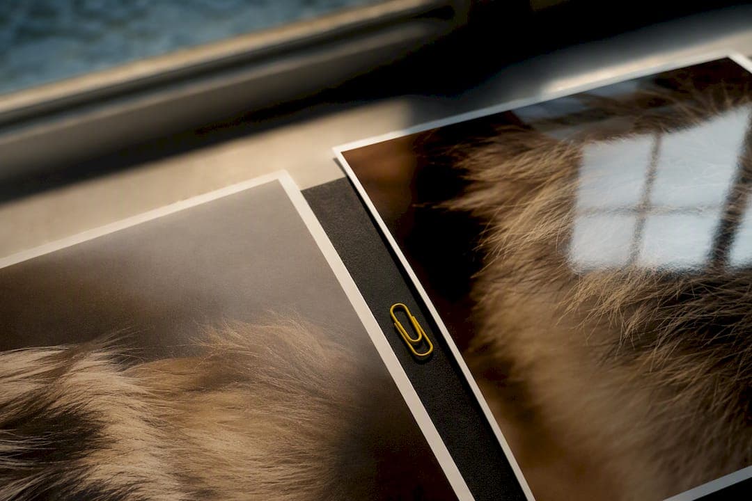
Choose glossy for vivid colour, punchy contrast and albums viewed under controlled light. Choose matte for framed pieces, anything handled often, and rooms with unpredictable glare. If you're stuck between the two, ask yourself three things: where will it live, who'll be touching it, and do you want the colour to pop or the mood to sit quietly on the wall?
TL;DR:
- Glossy prints provide the most vibrant colors and sharp contrast but are highly reflective and prone to fingerprints, making them unsuitable for handling or display in bright rooms.
- Matte finishes diffuse light, reduce glare, and hide fingerprints, making them ideal for framed artworks, handling, or rooms with unpredictable lighting conditions.
- Luster or satin finishes offer a middle ground, retaining much of glossy’s color depth while minimizing glare and fingerprints, making them popular for portraits and wedding prints.
- Production and handling considerations, like ink usage and drying times, differ between finishes, so checking with the printer before ordering can save costs and prevent surprises.
- For photos or keepsakes to be handled frequently or displayed under bright light, matte or satin finishes generally outperform glossy, especially behind glass where reflections and glare become more distracting.
Table of Contents
- Matte vs glossy paper at a glance
- Why do matte and glossy paper look so different?
- How do these finishes behave in real rooms?
- Which finish suits which project?
- What should you check before sending a print job?
- How do you choose a finish before you order?
- Are there finishes between matte and glossy?
- Choosing a finish for pet portraits and memorial keepsakes
- Why most finish advice misses the point
- Sources
Matte vs glossy paper at a glance
| Factor | Glossy | Matte | Luster/satin |
|---|---|---|---|
| Reflectivity/glare | High, mirror-like sheen | Low, diffuses light | Moderate, gentle sheen |
| Colour vibrancy | Strongest saturation and contrast | Softer, muted tones | Close to glossy, less punch |
| Fingerprints/smudging | Shows marks readily | Hides marks well | Resists marks reasonably well |
| Writeability | Poor, ink beads on surface | Good, takes pen and pencil | Fair |
| Best use | Albums, bold colour photography | Framed art, handled documents | Portraits, wedding prints |
Glossy wins on sheer visual punch. Matte wins on practicality. Luster splits the difference, which is exactly why it's a common professional default for portraits.
Why do matte and glossy paper look so different?
The difference comes down to what's on top of the paper, not what's underneath. Both are coated stocks. Matte isn't uncoated paper as many people assume. It's coated with a layer designed to scatter light in every direction, which flattens reflections and softens the overall look.
Glossy coating does the opposite. It sits smooth and dense on the surface, bouncing light back in a single, concentrated direction. That's why glossy prints read as more saturated and sharper: the reflected light boosts perceived contrast, particularly in shadow detail, and edges look crisper because there's less light scatter blurring the transition between tones. Matte can't do this trick, so blacks look softer and colours sit a touch more muted, even from an identical file.
There's a production-side difference too. Matte's porous coating tends to soak up more ink, which can push usage up by roughly 10 to 15% on some inkjet stocks compared with glossy. Glossy prints sometimes need longer to dry before handling, since the ink sits on the surface rather than absorbing into it.
How do these finishes behave in real rooms?
Put a glossy print in a sunny living room and you'll fight glare from every angle you stand at. Matte handles that same room without a fuss, because it scatters rather than mirrors the light hitting it.
Framing changes the calculation again. Behind glass, glossy paper can create a double reflection: one bounce off the glass, another off the print itself, which is distracting on a wall you pass daily. Matte is generally the safer bet for framed work for exactly this reason. If you're set on gloss behind glass, ask about anti-glare or museum glass and get a small framed sample first.
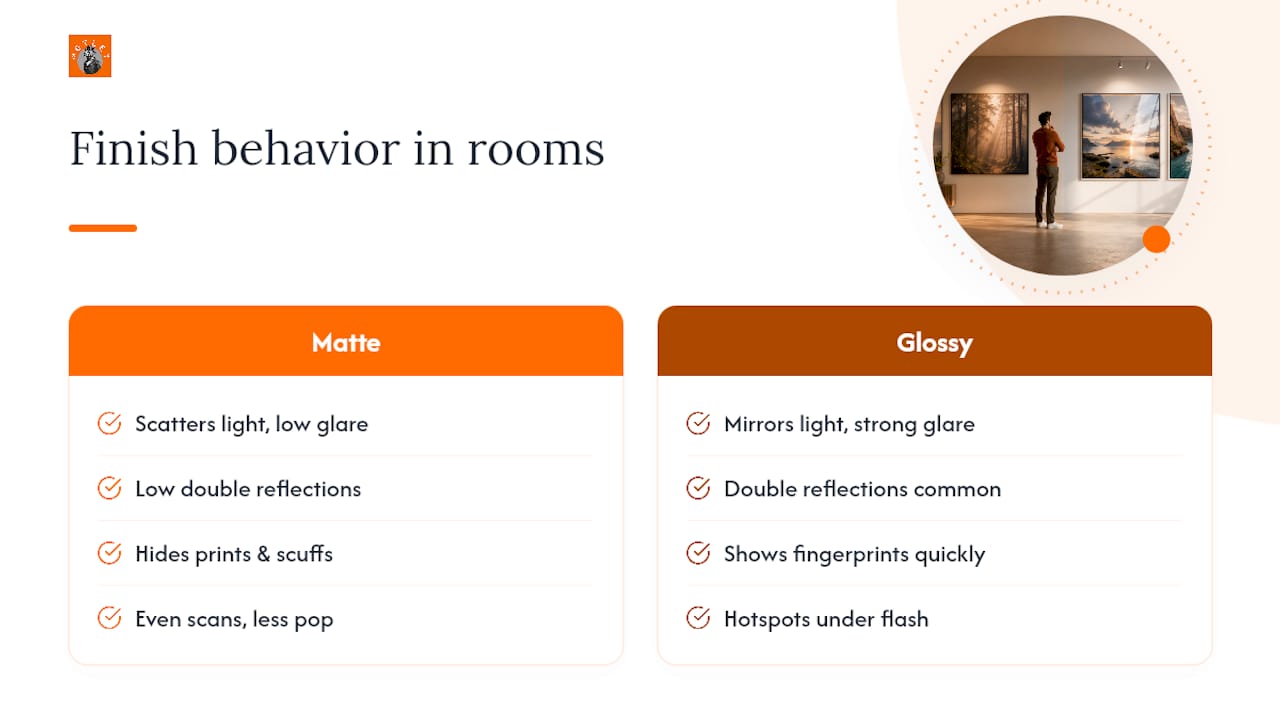
Handling tells its own story. Fingerprints and light scuffs show up fast on glossy. Matte hides them far better, which matters for photo albums passed round a family gathering or prints kids get their hands on. Scanning and photographing prints for digital use also plays out differently: glossy's reflections can create hotspots and glare under camera flash, while matte scans and photographs more evenly, though with slightly less pop straight off the page.
Which finish suits which project?
Matching the finish to the job saves you from reprinting later. A few pairings come up again and again:
- Glossy for photo albums, bold product photography and anything where colour needs to jump off the page under decent, controlled lighting.
- Matte for portraits, fine art reproductions, framed pieces for the wall, and anything someone might write on, like the back of a keepsake card.
- Luster or satin for wedding albums and portrait sittings, where you want most of glossy's vibrancy without the glare or the fingerprint problem.
- Mixed finishes for a single project, such as glossy for the cover of an album and matte for the interior text pages, are perfectly normal and often the smarter answer.
Skin tones are the one area where glossy tends to disappoint. It can add an unwanted plasticky sheen to faces that matte or luster avoids entirely, which is part of why portrait studios lean matte or satin by default.
What should you check before sending a print job?
Ink usage and drying time aren't just technical trivia. They affect turnaround and cost, so ask your printer which stock they recommend for your specific inkjet or laser setup before committing to a run, since not every printer handles both finishes equally well.
Protective options are worth a conversation too. Lamination adds scratch resistance to either finish, spot varnish can highlight specific areas without gloss-coating the whole piece, and museum glass solves most of the glare problem for framed matte or glossy work. For anything valuable or one-off, order a test print first. Comparing the same file, same crop, same size in both finishes before a large run catches surprises cheaply, rather than after fifty copies are already printed.
How do you choose a finish before you order?
Three questions settle most decisions in under a minute:
- Will people handle it often? If yes, lean matte. Frequent touching shows fingerprints fast on glossy.
- Will it be framed or displayed under bright, shifting light? If yes, matte again avoids double reflections and glare.
- Do you want maximum colour punch over practicality? If colour is the priority and the display environment is controlled, glossy or luster earns its place.
Once you've answered those, order comparison prints using the identical file, crop and size in both finishes so you're judging the finish, not a different edit.
Pro Tip: For anything going into a frame or destined as a keepsake, order one small framed sample before committing to a large print run. A finish can look completely different behind glass than it does lying flat on a desk.
Are there finishes between matte and glossy?
Luster and satin sit in the middle, and for good reason. They keep much of glossy's colour depth and contrast while cutting the glare and fingerprint issues that come with a full-gloss surface. That combination is why many wedding and portrait professionals choose satin as their working default rather than choosing between the two extremes.
Spot gloss or spot UV coating goes further still, applying a glossy varnish only to selected areas, such as a logo or a highlight, over an otherwise matte piece. It's effective for brochures and business cards but adds a production step, so expect a small cost premium and slightly longer turnaround over a single uniform finish.
Choosing a finish for pet portraits and memorial keepsakes
For hand drawn pet portraits and memorial pieces, matte or luster usually serves the artwork better than gloss. These pieces tend to live framed on a wall or handled gently as keepsakes, and matte avoids the glare that would otherwise sit between you and a memory you want to see clearly.
If you're commissioning a piece through Motleystudio's custom portrait range, mention where the print will hang and how it'll be displayed. That single detail helps match the finish to the piece before it's printed, not after.
Why most finish advice misses the point
Most guides treat this as a technical spec sheet: coating type, reflectivity, done. That's backwards.
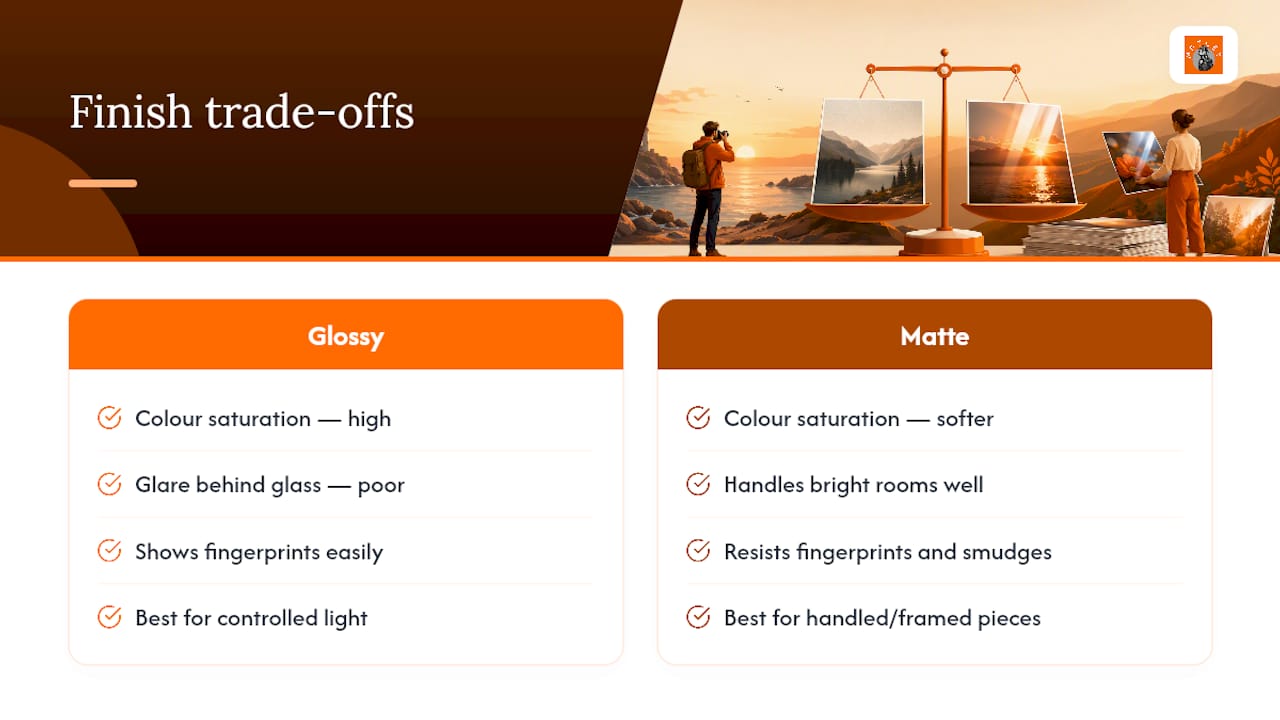
The conventional advice oversells glossy for anything colour heavy and undersells how badly it performs behind glass or in a well-lit lounge. Meanwhile, matte gets dismissed as the "safe but boring" choice, when it's often the only finish that survives contact with actual human hands and windows without complaint.
Prioritise the room and the handling first, the colour mood second. A stunning glossy print that nobody can view without glare from the window is a wasted print, no matter how rich the colour looked on screen. Order a small sample before committing to a large or framed piece. It costs little and settles an argument that specs alone can't.
— Motley