
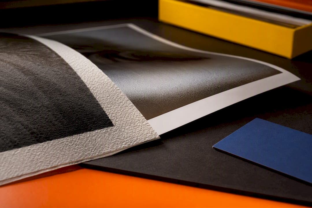
Choose giclée for fine art, limited editions and anything you want on the wall for decades: pigment inks and archival paper hold colour far longer. Choose a photo print for glossy, true-to-life snapshots, event photography or bulk runs where cost and turnaround matter more than permanence. The trade-off is simple: giclée buys you longevity and texture, photo prints buy you speed, sheen and a lower bill.
TL;DR:
- Giclée prints use pigment-based inks on fine-art papers and can last over a century, making them ideal for gallery-quality and memorial pieces.
- Photo prints rely on dye-based chemistry and resin-coated paper, typically lasting only a few decades, suitable for event photos and casual wall art.
- The term giclée is not standardized and requires verifying ink type, paper quality, and archival testing rather than trusting the label alone.
- Pricing for giclée is significantly higher due to better materials and more complex printing processes, making it worth the investment for lasting artworks.
- Testing proofs on the actual substrate before full production is essential to ensure quality, color accuracy, and longevity of the final print.
Table of Contents
- Giclée vs photo print at a glance
- What is a giclée print, exactly?
- What is a photographic print?
- Why the technical differences change what you see
- How long will your print actually last?
- What should you expect to pay?
- How to test and order without getting it wrong
- Why we lean towards giclée for pet portraits
- Commission a printed portrait built to last
- The choice that matters more than the label
- Sources
Giclée vs photo print at a glance
Both methods can produce a beautiful image, but they're built for different jobs. Here's the quick contrast before we get into the mechanics:
- Process: Giclée uses pigment-based inkjet printing; photo prints use chromogenic (RA-4) chemistry or dye-based digital printing.
- Inks: Giclée relies on pigment particles that sit on the paper surface; photo prints use dyes embedded in a light-sensitive emulsion.
- Substrates: Giclée favours cotton rag, fine-art matte and baryta papers, plus canvas; photo prints run on resin-coated (RC) gloss, lustre or matte stock.
- Longevity: Giclée generally outlasts standard photo prints in typical display conditions.
- Cost: Giclée costs more per print; photo prints are cheaper, especially at volume.
- Best for: Giclée suits gallery work, memorials and limited editions; photo prints suit events, albums and casual wall art.
Whatever you choose, order a proof on the actual substrate before committing to a full run.
What is a giclée print, exactly?
"Giclée" is pronounced zhee-clay, borrowed from the French verb meaning "to spray" or "squirt". The term was coined in the early 1990s to describe fine-art reproductions made on early large-format inkjet printers, and it stuck as a way to distinguish gallery-quality prints from ordinary inkjet output. Here's the catch: giclée is not a legally defined standard. Anyone can print something and call it giclée, so the word alone tells you nothing about ink quality or paper archival rating.
In practice, a genuine giclée workflow uses pigment-based inks fired through large-format printers with far more ink channels than a typical desktop machine. These printers lay pigment onto fine-art papers such as cotton rag, matte art paper, baryta, or canvas, producing a print with visible texture and depth that photographic paper simply can't replicate.
What is a photographic print?
A traditional photo print comes from chromogenic processing, often called RA-4, where light exposes a silver-halide paper and chemical development brings out dye-based colour. Many modern labs now use digital exposure units feeding the same RA-4 chemistry, which is why you'll still hear it called a "true photographic print" rather than an inkjet print.
The result is a continuous-tone surface, smooth and free of visible dot patterns, typically on resin-coated (RC) paper in gloss, lustre or matte finishes. Gloss gives punchy contrast and reflective shine; lustre softens glare while keeping detail sharp. Photo prints make sense when you need volume, quick turnaround, or a familiar glossy look for albums, event photography, or everyday wall art.
Why the technical differences change what you see
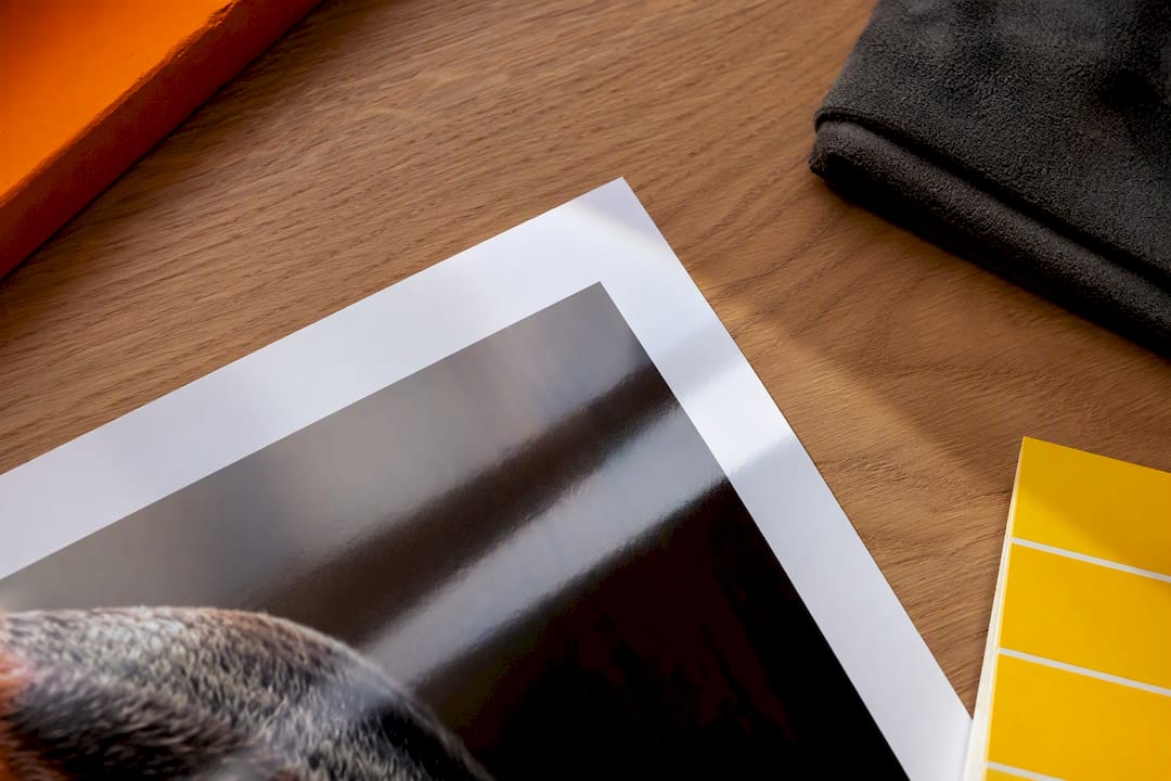
Ink chemistry is where the two methods properly diverge. Pigment particles sit on top of the paper fibre rather than soaking in, which is why they resist fading far better than the dyes used in most photo prints, and why blacks stay dense rather than turning brown or magenta over time.
Colour range matters just as much as fade resistance. A basic four-colour (CMYK) system struggles with deep purples, saturated oranges, and subtle greens. Professional giclée printers often use eight, ten, or even twelve ink channels, extending the gamut well beyond what CMYK or standard RA-4 photo chemistry can reach. That extra range shows up in a sunset with real orange fire in it, or a dark background that reads as black rather than muddy grey.
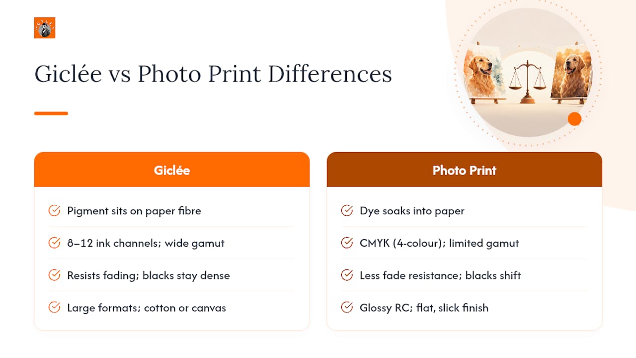
Scale plays a part too. Giclée printers handle large formats comfortably, and the paper's texture, whether cotton rag's soft tooth or canvas weave, adds a tactile quality that gallery buyers specifically look for. A glossy RC photo print, by contrast, always reads as flat and slick, however sharp the image.
How long will your print actually last?
Pigment-based prints generally outperform dye-based ones on display life, and that's not a marginal difference. Vendor comparisons commonly cite pigment giclée prints lasting well over a century under suitable conditions, against a few decades for many dye-based photo prints before visible fading sets in. Treat that as an industry rule of thumb rather than a lab-certified guarantee, since testing conditions vary between manufacturers.
Permanence in short: pigment inks sit on the paper surface and resist UV breakdown; dye-based chemistry embeds in the emulsion and fades faster under normal room lighting.
Framing decisions matter as much as the print method. Acid-free mounting board and UV-filtering glazing extend display life significantly, whichever process you've chosen, so don't spend on premium pigment ink and then mount the piece with cheap adhesive or unfiltered glass.
What should you expect to pay?
Giclée costs more because every input costs more: cotton rag and baryta papers are pricier than RC stock, pigment ink sets cost more than dye cartridges, and limited-edition runs involve careful colour-matching that takes time. That premium is worth paying for a piece going to a gallery, a collector, or standing in as a memorial portrait meant to outlast the family that commissioned it.
For bulk event photography, everyday albums, or a casual print for the hallway, a photo print does the job at a fraction of the cost. The two price bands do overlap at small sizes, though, so always compare quotes on the same dimensions and finish before assuming one option is automatically cheaper.
How to test and order without getting it wrong
Because the word "giclée" carries no guarantee, the only way to judge quality is to see it on paper first. Follow this sequence with any supplier:
- Order a small proof on the exact substrate you intend to buy, not a generic sample sheet.
- Ask for the ICC profile used, or request a soft-proof so you can check colour before printing.
- View the proof under the lighting where the finished piece will actually hang.
- Ask which pigment brand and paper the supplier uses, and whether they can confirm archival testing data.
- Confirm trimming, mounting, and framing options before you commit to a full-size run.
Pro Tip: View your proof already framed under the actual glazing you plan to use, since UV-filter glass or acrylic changes how texture and depth read, particularly on cotton rag or canvas.
Why we lean towards giclée for pet portraits
When a portrait is standing in for a pet that's no longer here, permanence isn't optional. Motleystudio favours pigment-based giclée finishes on fine-art substrates for commissioned work precisely because the texture and archival quality suit something meant to be looked at for years, not seasons.
Our ordering process keeps that decision simple: you choose from a portfolio of styles, we guide you towards the finish that fits the piece, and proofs are part of how we settle on the right paper before anything goes to full production. The gallery on our site shows the range that's possible once the print method is right, not just the illustration.
Commission a printed portrait built to last
If you've read this far because you want a portrait of your own pet done properly, that's exactly what Motleystudio exists for. We turn a phone photo into a custom piece of art, then print it on a fine-art substrate chosen to hold its colour and texture for years rather than fading in a few seasons on the windowsill.
There are other routes to a printed pet portrait: a general print shop, a stock photo template, or a DIY inkjet at home. None of them start with an artist actually looking at your photo and building a bespoke piece around it. Our process starts online, takes your reference photos, and walks you through style and finish choices before anything reaches print, so you're not left guessing whether the paper or ink will do your pet justice.
Head to the custom portrait order page to see the style options and start your own commission today.
The choice that matters more than the label
Here's what most guides skip: the giclée-versus-photo debate isn't really about which process is "better" in the abstract. It's about matching permanence to purpose. A wedding album doesn't need hundred-year pigment stability. A memorial portrait of a dog who died eight years ago absolutely does, and treating that decision casually is the single most common mistake people make when ordering prints.
The industry's failure to standardise "giclée" makes this worse, not better. Because any print shop can slap the word on an inkjet output regardless of ink or paper, the term has drifted from meaning something specific to meaning "sounds fancier than regular printing". That's precisely why a proof matters more than a label. Ask what ink, what paper, what gamut, and look at the actual print under the light it'll live under. Skip that step and you're trusting a marketing word, not a material fact.
What we'd push back on is the instinct to default to photo prints purely because they're familiar. Glossy RC paper looks great in an album and terrible framed on a wall for a decade, where its dye-based colour starts to shift while a pigment print next to it barely moves. Match the process to how long the piece needs to matter, not to habit.
— Motley
Sources
- Giclée - Wikipedia
- What Is a Giclée Print? Fine Art Print Terms Explained
- Giclée vs. Photo Prints: What’s the Difference? – The Stackhouse
- Giclée vs Photo Prints: The Ultimate Quality Comparison